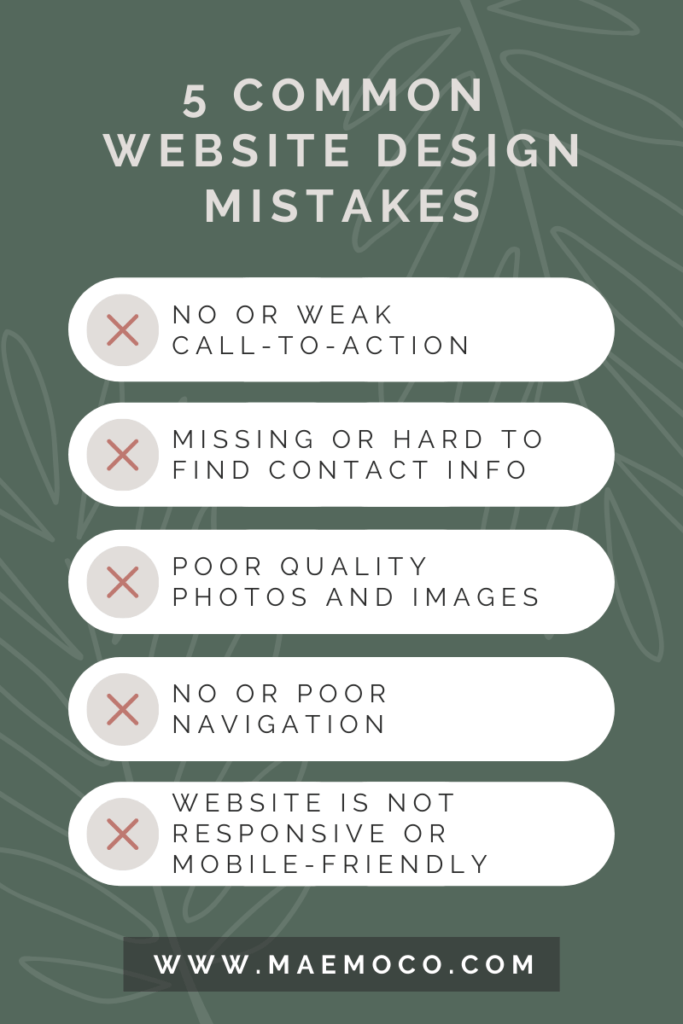
5 Common Website Design Mistakes
Your website must look nice, as well as generate revenue.
Many businesses continue to struggle when it comes to designing a website that increases conversions and generates income.
Businesses still make the mistake of focusing on a design that looks appealing rather than one that maximizes conversion rates.
These mistakes tend to be subtle, yet they cause a lot of harm.
They overwhelm visitors, make it harder for customers to find information or make purchases, as well as introduce other needless problems. This pushes people away.
If you want to boost the quantity of traffic, leads, and sales your website receives, then you will want to avoid these 5 common website design mistakes.
It takes time and effort to correct these errors, but it’s not impossible. It all starts with identifying all of the issues on your website.
Let’s take a closer look at those mistakes.

1. No or Weak Call-to-Action
What is a Call-to-Action (CTA)?
Oxford describes this marketing term as “a piece of content intended to induce a viewer, reader, or listener to perform a specific act, typically taking the form of an instruction or directive”.
Lacking or a weak CTA is one of the most common website design mistakes.
The user just arrived at your website. What exactly do you hope from them now? You must guide them in the direction of the next action, whether it’s a purchase, a subscription, or a lead.
The optimal website user experience should communicate what, where, and how to a customer.
Some CTA examples you’ve likely seen on other websites:
- Subscribe
- Learn More
- Register Now
- Get 50% Off Now
- Try for Free
These CTAs point users towards exactly what they need to do on the website.
2. Missing or Hard to Find Contact Information
Another simple, yet impactful common website design mistake.
Have you ever went to a website but could not find a way to contact the business? Frustrating, right?
If a visitor is forced to search your site for contact information, he or she will also likely get frustrated and leave your website. Users don’t want to have to work to contact you about your services or products.
Your contact information should be at the bottom of every page or a “Contact Us” page should always be a single click away.
3. Poor Quality Photos and Images
Because your website may be a potential customer’s initial introduction to your business, any photography featured on it should be of the highest quality.
Ensure that photos and images are sharp, and avoid using anything that is blurry or pixelated.
Pixelated photos aren’t the only form of low-quality imagery. Without having to physically read text, images can express complicated ideas rapidly. Irrelevant photos, on the other hand, will just confuse your readers and make them question what you’re trying to say.
Generic stock photos are a great example of this. Stock photographs, when used correctly, offer meaning to your content. These images help visitors understand what you’re saying by emphasizing your message.
Original photos are the way to go. Ensure they are of the highest quality, even if this involves hiring a professional photographer.
A mistake like using images of poor quality will detract from the appeal of your website and turn off visitors.
4. No or Poor Navigation
Have you ever visited a website and been unable to locate the menu or search bar? It’s as frustrating as hard-to-find or lack of contact information,
Making your navigation menu difficult to find, or lack thereof is another common web design mistake.
Your website should be designed to allow for rapid and simple navigation so that a user never gets lost. If a user gets lost, you’ll almost certainly lose them as a potential customer.
A clearly visible navigation bar must be present and prominently placed so that it can be viewed on any size screen. Don’t forget about the sitemap, which should allow users to rapidly and simply navigate to any page on your website.
5. Website Is Not Responsive or Mobile-Friendly
Around half of all online traffic is generated by mobile devices.
Responsive design makes your website accessible to everyone, no matter what device they are using.
If your page cannot be properly navigated using a smartphone or tablet, you may be losing a considerable amount of visitors and conversions.
Provide a consistent experience across all platforms–desktop, tablet, and, most importantly, mobile.
Don’t be one of those websites with a bad design.
A website could be your company’s most valuable asset, therefore make it perfect to make a good first impression.
To achieve this, however, you must avoid the 5 website design mistakes mentioned in this post.
These typical website design mistakes are simple to avoid and repair. The most difficult part is identifying them.
However, now that you’re aware of these mistakes, you may easily avoid or correct them in the future.
With so many responsibilities as a business owner, consider hiring a professional web designer to help take care of these mistakes.
They can assist you in ensuring that your website generates leads for your company by offering an excellent user experience for your clients.
In addition to website design and development, the ideal creative partner should be able to offer advice on effective content marketing to attract an audience, search engine optimization approaches, and a successful social media strategy.
Maemo & Co. can help with all that.
Contact us now to remedy your common website design mistakes.


